My Playroom
My Playroom initially focused on providing basic children's recreational products for local families. Over the years, closely aligning with market demands and evolving preferences of parents and children, they have carefully developed and continuously refined various educational toys and children's home products. After several product iterations and upgrades, they have expanded from simply selling toys to offering a diverse product line including high-quality open-ended toys, adjustable children's furniture, rich learning resources, unique wooden toys, and exclusive Montessori items. Their service area has also expanded from Canterbury local area to broader regions, winning the favor of many families.
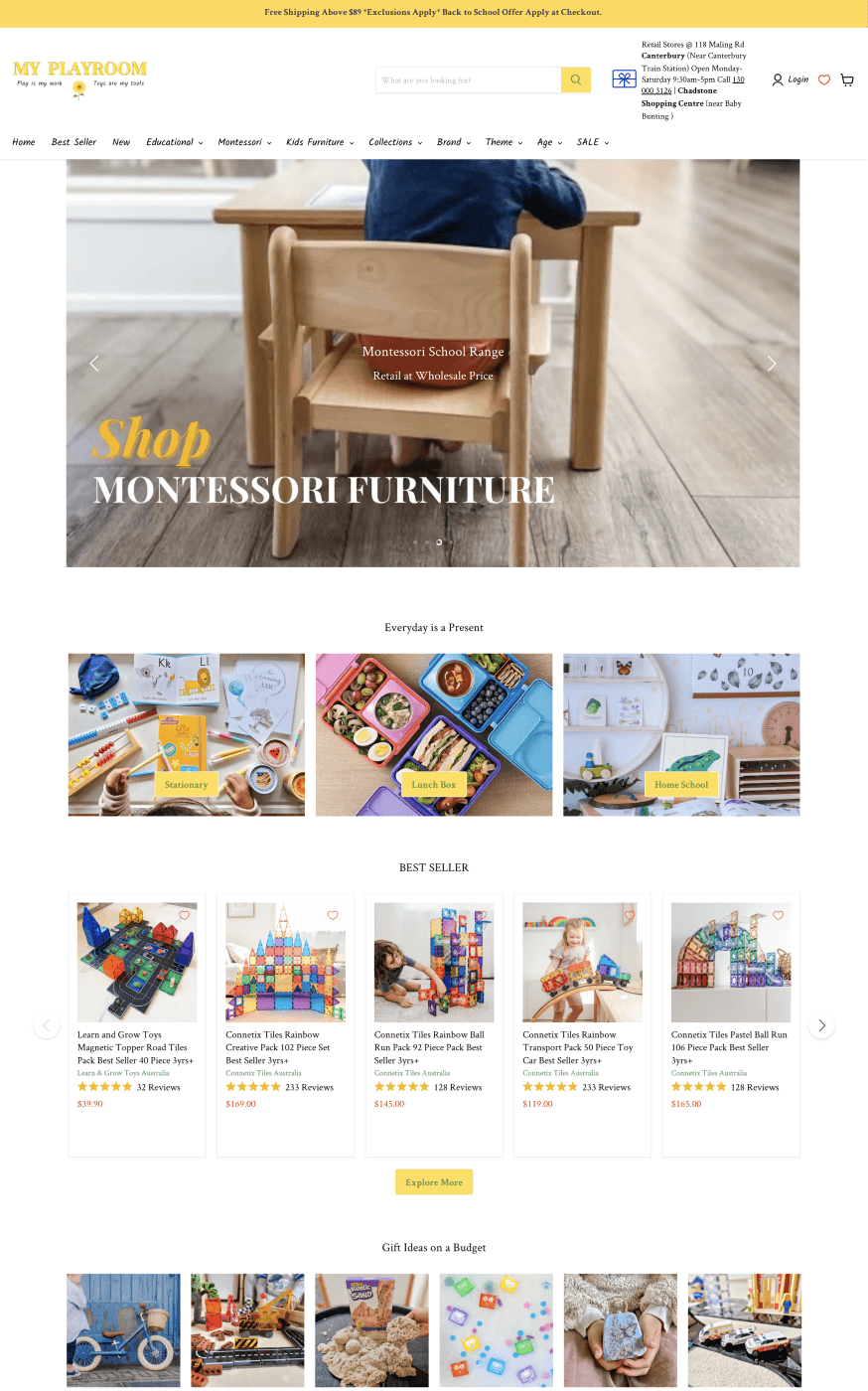
+ 52.2%
Organic Traffic
+ 335%
Website Exposure
+ 347%
Website Clicks
+ 38
Google 1st Page Keywords
Data from September 2024 to January 2025
The Problem
My Playroom operates in the educational toy and children’s homeware market — a textbook case of "a good product is not the same as a product that sells". Through years of iteration the client’s range had expanded from a single toy line to open-ended toys, adjustable children’s furniture, wooden toys and Montessori materials, with quality that holds up against anyone in the category. In search results, however, product quality is invisible.
The market contains several strong competitors, one of them particularly formidable, all continuously increasing investment in online marketing and SEO to capture a finite pool of search traffic. My Playroom’s keyword rankings had long been stuck below a ceiling, and on the highest-volume industry terms the site could not compete at all, leaving traffic growth stalled.
The problem did not stop at traffic. Even when visitors did arrive, conversion from browsing to actual purchase was equally weak — a lengthy checkout, repeated form filling and limited payment options, all of which are magnified sharply in the real purchasing context of a parent holding a child in one arm and a phone in the other.
The client’s brief was therefore twofold: catch up with competitors on keyword rankings and traffic, and convert the traffic that arrived into actual orders rather than a flattering visit count.

Our Solution
This project had to solve two things simultaneously: getting searchers to find My Playroom, and getting those who found it to complete a purchase. The first depends on keyword and content coverage, the second on rebuilding the conversion path — neglect either and the investment in the other is discounted.
Keyword Research Balancing Head and Long-Tail Terms
My Playroom’s range is broad, which is both a challenge and an opportunity. Beyond competing for high-volume category terms, we placed greater weight on long-tail terms with limited volume but unmistakable intent — "connetix magnetic tiles", "wooden marble run", "montessori toys". Parents searching these already know exactly what they want, so conversion rates far exceed those of casual browsing traffic, while competitive intensity is a fraction of the category terms.
We also dissected the main competitors’ keyword footprint in detail: which high-ranking terms they held, how strong the competition was on each, and which valuable queries remained uncovered. That set our priorities, directing limited resources to the positions that were both quickest to win and most commercially valuable.
Page-Level Optimisation
When placing keywords on pages we held strictly to natural integration and avoided stuffing — stuffing damages readability and, under current algorithms, no longer works anyway. Every page’s title, meta description, H1 tag and image alt attributes were refined individually, satisfying search engines’ need to identify the page while giving users clear, useful signposting.
Site Architecture and Technical Performance
We restructured the site architecture, promoting key product pages and related content while cutting unnecessary hierarchy levels so authority could pass more directly to commercially valuable pages. Internal linking was rebuilt in parallel, tying product pages closely to related articles and buying guides — which both allows crawlers to traverse the site completely and gives users a natural browsing path.
On performance we worked several angles at once: compressing image sizes, introducing a content delivery network (CDN), stripping down JS and CSS, and enabling browser caching. Mobile was the priority — the overwhelming majority of toy shopping by parents happens on a phone, often during a commute or after bedtime, and one extra second of loading can cost an order.
Content Marketing to Establish Authority
We wrote detailed buying guides and recommendations for every toy and furniture product, focusing not on specification lists but on educational value, suitable age ranges and how each product is used — precisely where parents actually hesitate.
Beyond the products themselves, we published a steady stream of blog content around children’s education, developmental psychology and parent-child interaction — the topics this audience follows most closely. That content captures searches that have not yet reached the purchase stage, making the site a reference point in a parent’s day-to-day, so it becomes the natural first choice when a need does arise. Structurally we balanced readability with SEO — clear paragraphs and distinct headings, with optimisation that never intrudes on the reading experience.
Industry Link Building
We established content-sharing and backlink partnerships with education platforms and children’s product peers, bringing in a steady flow of high-quality links from relevant fields. Topical relevance is the key here — a link from the education or parenting sector contributes far more to authority within that subject area than a general-purpose backlink.
Rebuilding the Checkout and Cart Conversion Path
This was the largest investment in the project and the part with the most direct effect on revenue. The original checkout carried a great deal of redundancy, requiring users to enter information repeatedly across multiple page transitions. We stripped the forms back to essential fields only — delivery address and contact details — and consolidated the whole checkout into a single page where every step is visible at once and payment follows immediately.
Payment options were expanded to run credit card, PayPal and local payment platforms in parallel, letting users choose their habitual method and reducing abandonment at the payment step. The cart was rebuilt alongside: product name, quantity, price and image all shown clearly, a "continue shopping" entry point added for topping up an order, current multi-buy and limited-time offers surfaced prominently, and stock and delivery information made transparent — so nobody reaches the final step only to discover an out-of-stock item or unexpected shipping cost and abandon the order.
We also added live chat support on the cart and checkout pages. Parents buying for children have very specific questions — is it right for this age, is the material safe, how long will delivery take — and whether those questions get answered at the moment of hesitation decides directly whether the order closes.
The Result
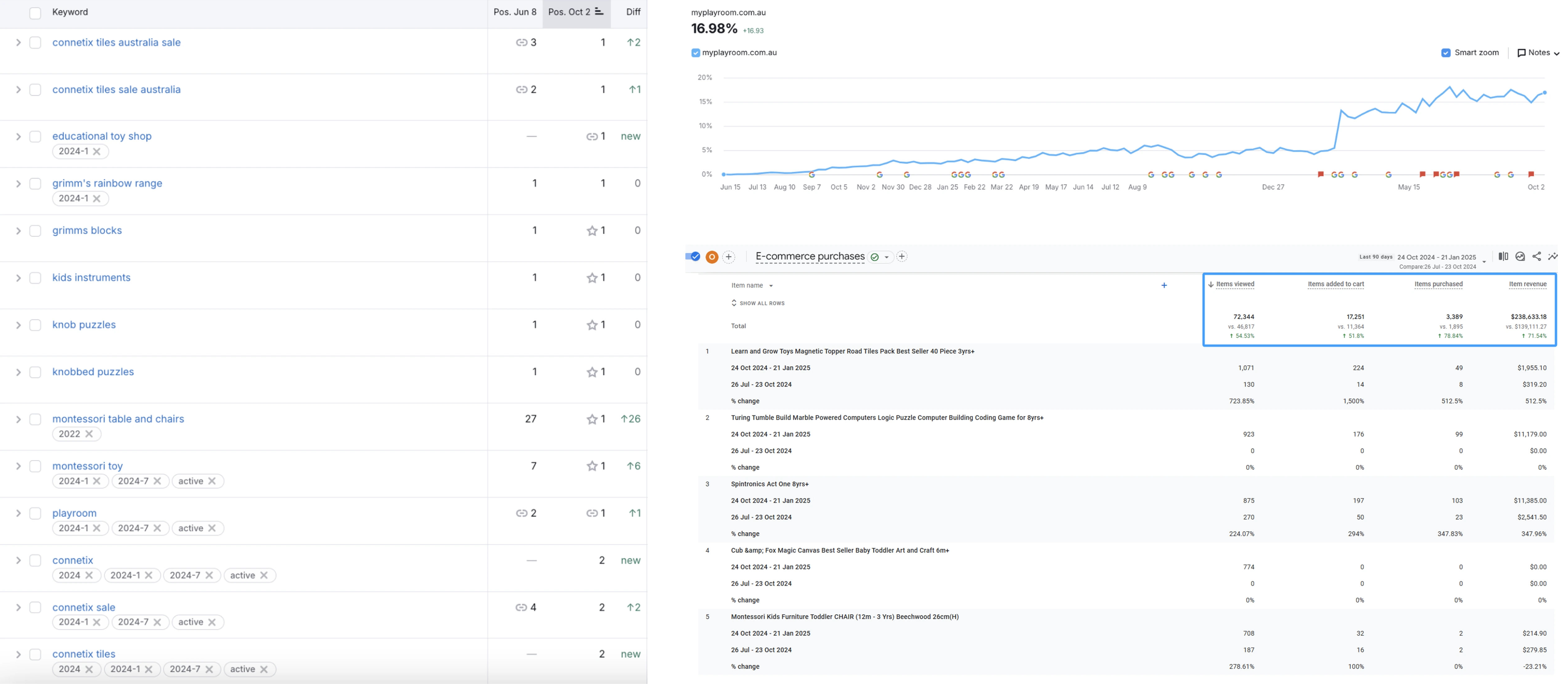
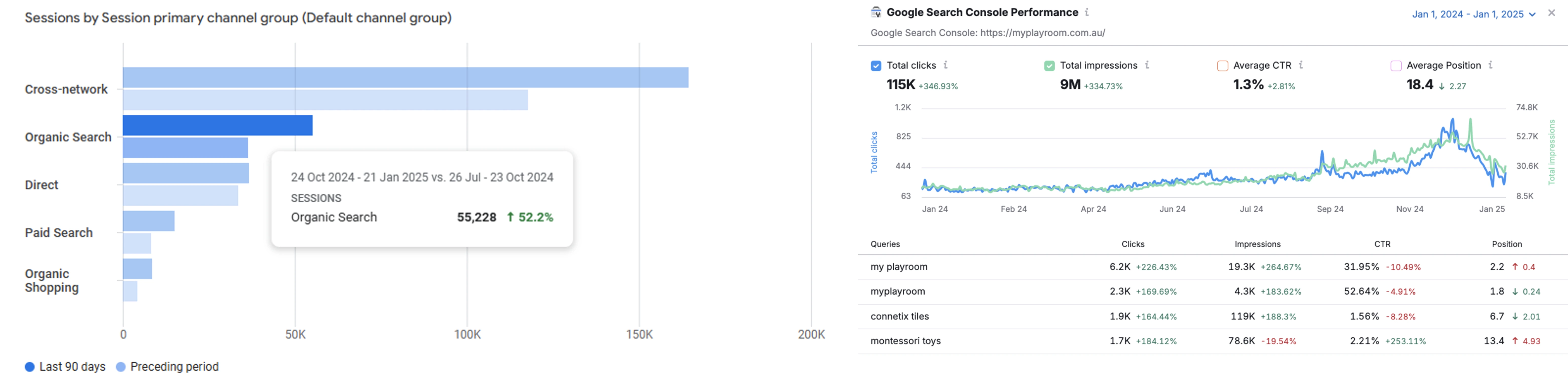
From September 2024 to January 2025: website clicks rose 347%, website impressions rose 335%, 38 keywords reached Google’s first page, and organic traffic grew 52.2%. Fifty-five keywords held steady in Google’s top five, while over the most recent three months conversion rate grew 78.84% quarter on quarter and revenue rose 71.54%.
Click growth of 347% outpacing impression growth of 335% is an uncommon relationship in SEO projects and deserves separate comment. Typically expanding coverage produces a wave of impressions first, with click-through rate diluted because new terms rank low. Here clicks outran impressions, which means the improvement in ranking position was substantive — users not only saw My Playroom more often, a higher proportion of them clicked through when they did. The 55 keywords holding in the top five are the direct support for that: the click-through gap between the top five and the second page is an order of magnitude.
The long-tail strategy shows through clearly here. A parent searching "connetix magnetic tiles" is at a completely different decision stage from someone searching "children’s toys" — the former has already decided what to buy and is only choosing where. That traffic naturally carries higher click-through and conversion rates, and it is why click growth was able to exceed impression growth.
The conversion figures are where this project lands. Over the most recent three months conversion rate grew 78.84% quarter on quarter and revenue rose 71.54%. Conversion rate growing faster than revenue indicates order volume grew faster than order value, with average order value easing slightly — consistent with the customer mix the long-tail strategy brings in, since these buyers typically start with a single item. In a repeat-purchase category like children’s toys, the value of those new customers continues to be released through subsequent orders.
Improving both traffic and conversion is what allowed the ranking gains to translate into revenue. In a market where competitors kept raising their investment, My Playroom is no longer simply "a good product nobody sees" — it has a complete path running from search discovery through to a completed order.
Related Projects
Check out other similar projects




Get a Free Quote
Let's talk about your goals
Melbourne
Scan the QR code to add our WeChat customer service for faster professional consultation.